Typography is the art or process of arranging type or processing data and printing from it. In this course we learned about the history of type and learned to use typography for different page designs.
Page Design (Study of the Roman Empire and the Renaissance)
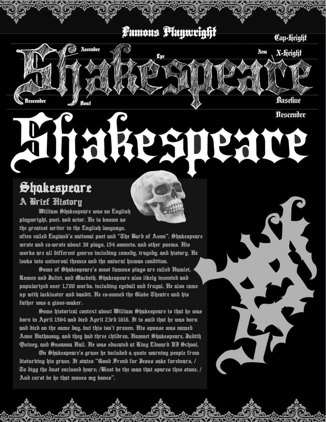
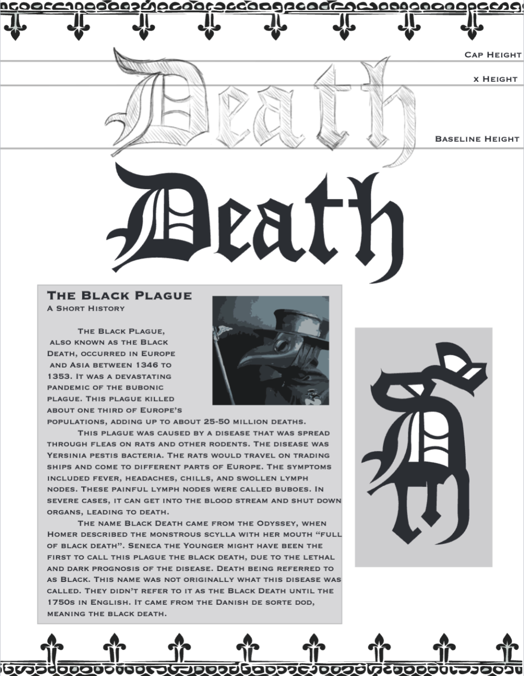
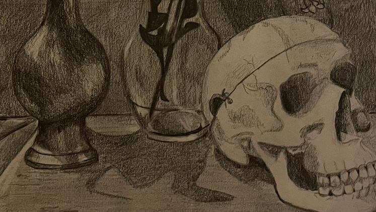
The goal for this assignment was to choose a font style that was used during the Roman Empire and the Renaissance era. I chose fonts resembling the BlackLetter fonts. For this assignment, I drew my own fonts, created a symbol using the letters, and researched my topic to connect it to my page design.
Using photoshop for sketches and illustrator for the page layouts, I was able to create a fluent page that resembled the gothic era of typography. I wanted to keep the pages black and white to bring out the decorative shapes and styles of this period.
Art Nouveau page design
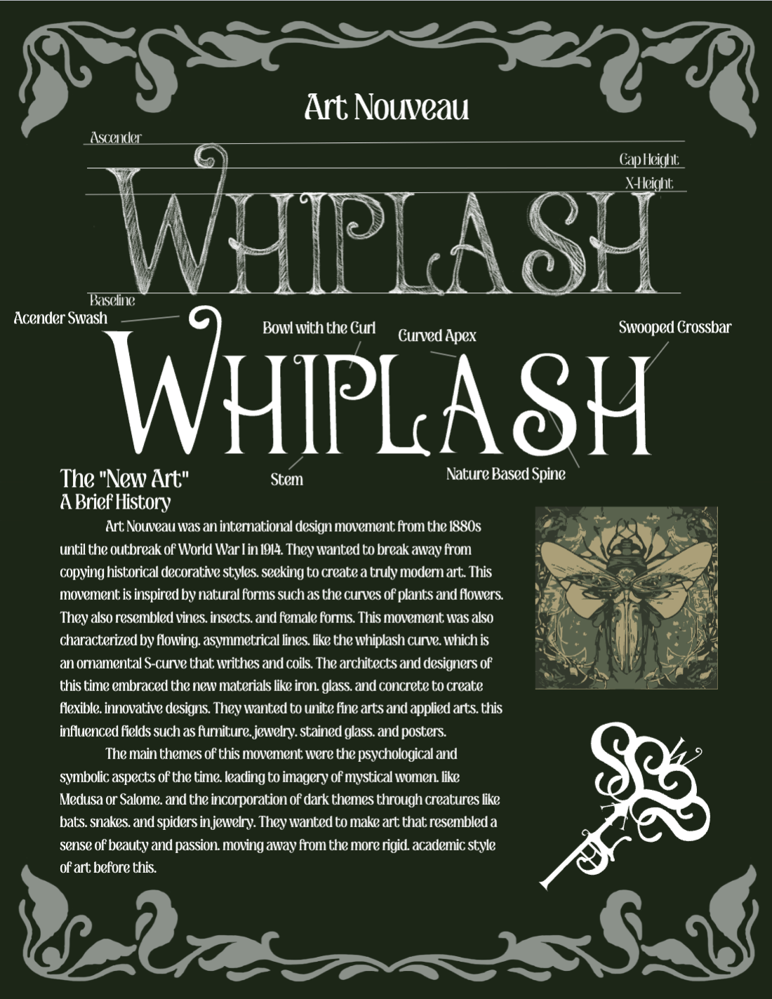
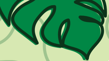
The goal of this assignment was to create a page layout that resembled the art nouveau era. This era was during the 1800s, and was a more decorative style of typography.
I used photoshop to sketch the stylized font and create the naturalistic boarder. I wanted keep the organic shapes used during this period, and use the color green to connect to nature. The new art era was focused on becoming more decorative rather than structured.
This font uses thin stems and curved features to appear more natural and fluid. Each letter uses straight lines to maintain structure, while adding swoops to connect more to the naturalistic art nouveau style.
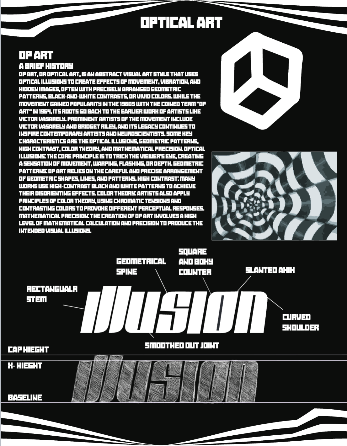
Optical Art
The goal of this project was design a page that expressed 20th century art styles. I chose to research optical art, which is the used of black and white lines to create an illusion.
For this assignment, I sketched my font with photoshop and used illustrator to design a page full of optical illusions. I wanted to include different types of illusions, like the 3d box and layered line illusions. The font i chose is very block with straight lines in order to keep the page fluent.
For this project, I also analyzed the different aspects of the font. This font uses rectangular shapes for the stems and curved shoulders to keep the letters evenly spaced and approximately the same size. They do this to make it legible, while still being stylized.
Swiss Design Page Layout
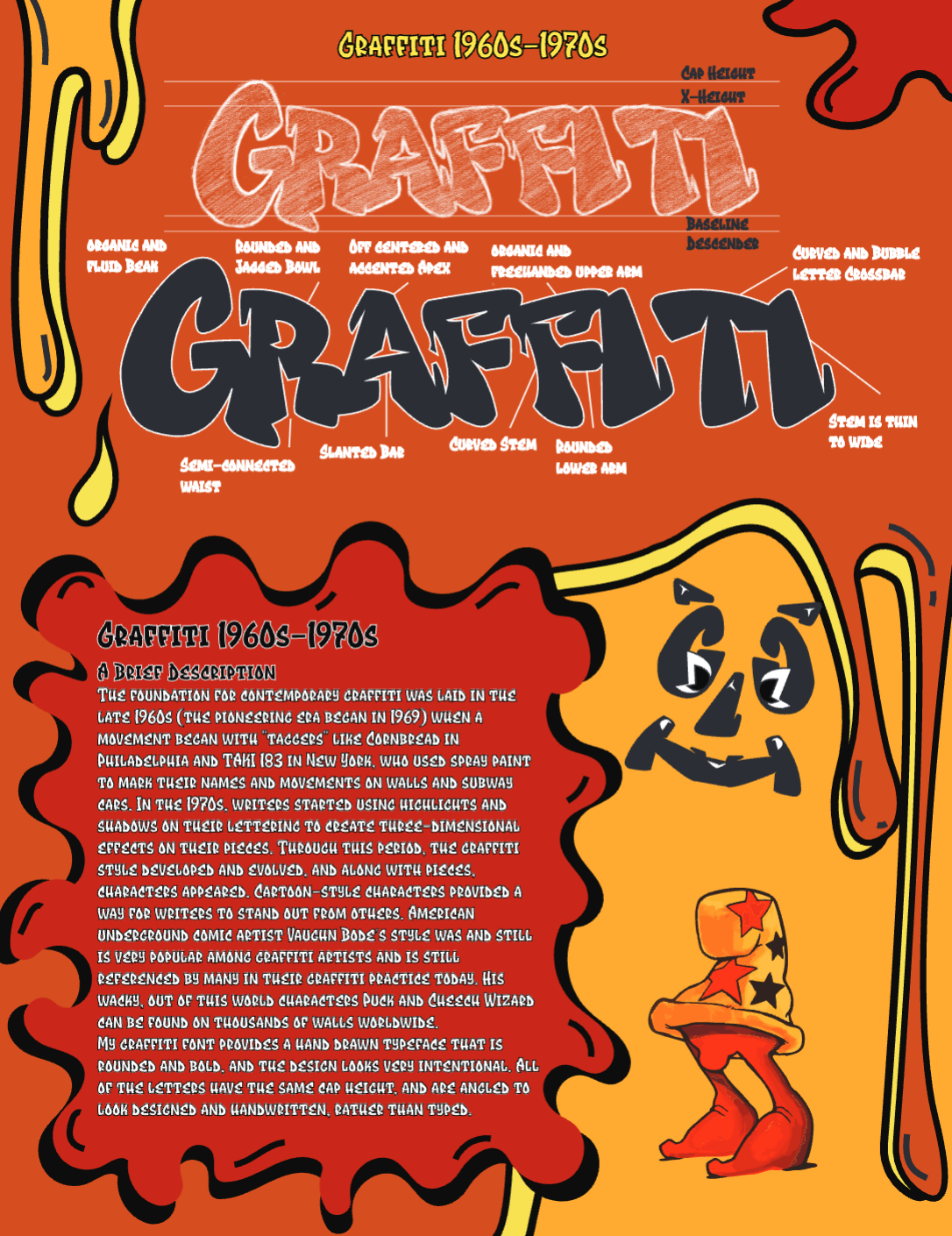
The goal of this project was to look into the 1970s style of typography. I wanted to research about the origin of graffiti.
For this project, I created a sketch of graffiti style lettering. I used photoshop to sketch the font and traced it using illustrator. In illustrator I also create a detailed page design of graffiti textures. I used the pen tool to create all of my shapes and colors. I wanted it to look like a work of street art.
I created my graphics with the pen tool, and then added in my research. I created a graffiti-like graphic for my symbol and image traced a character from Cheech Wizard’s art, which was a prominent street artist during the period.
Study of font classification
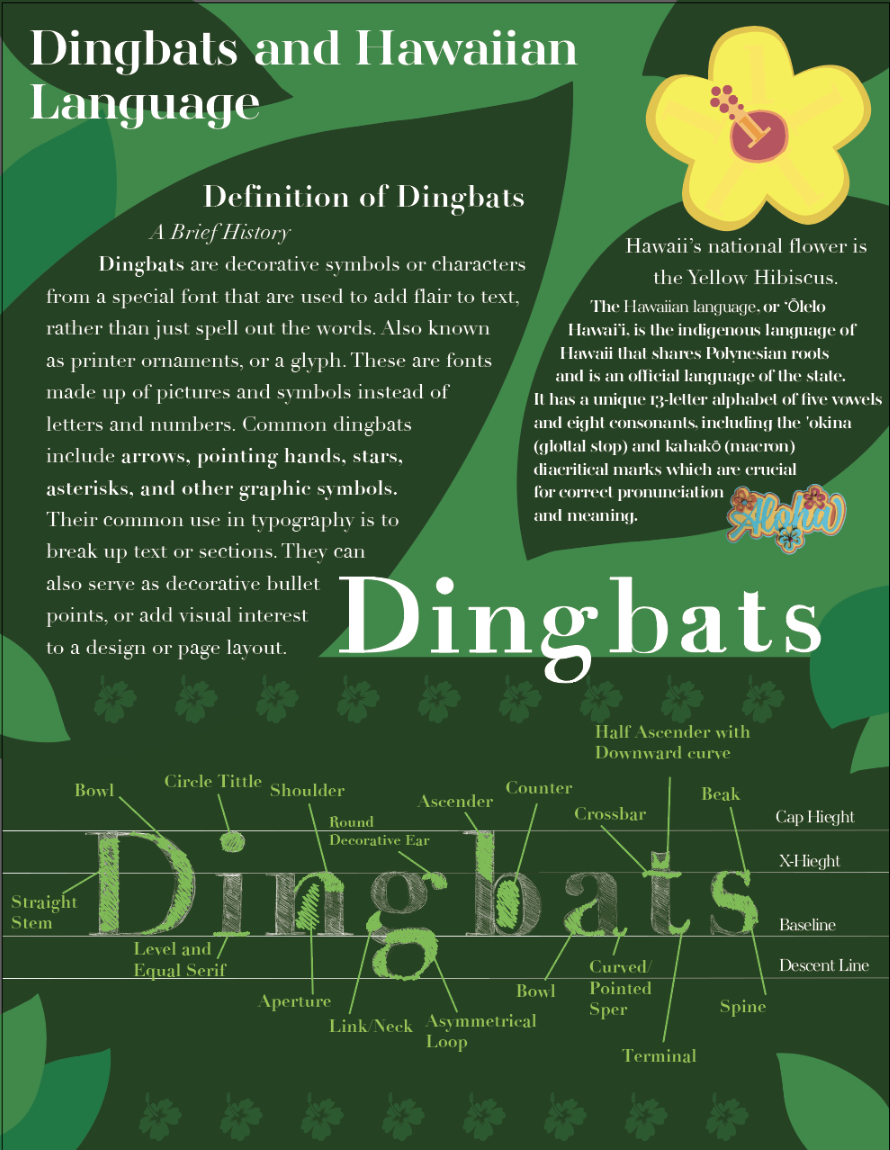
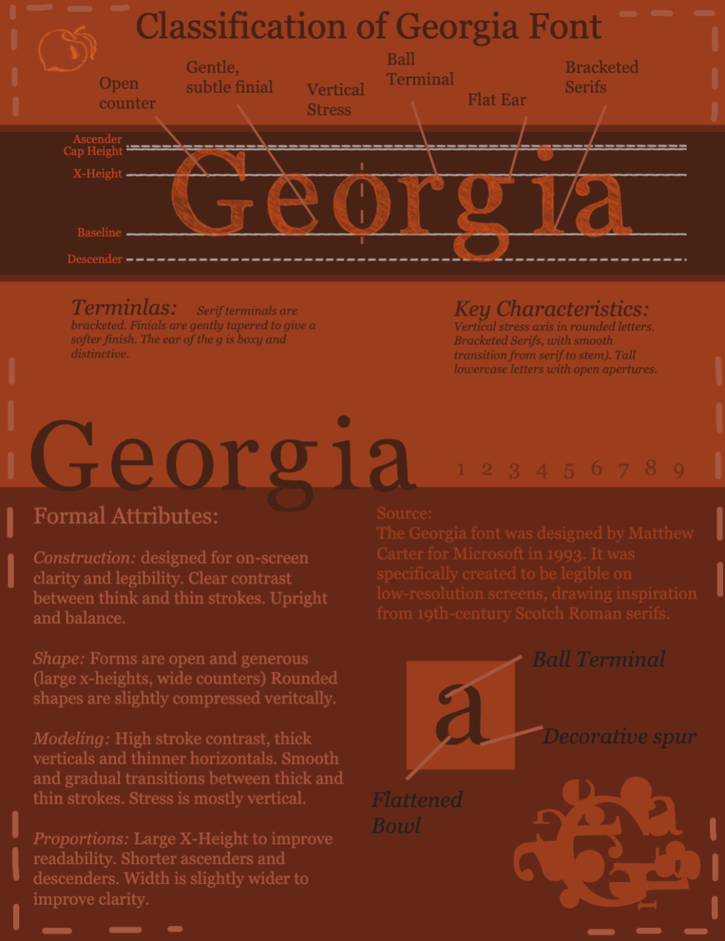
For these assignments, we needed to analyze aspects of a font.
For the first page layout, I researched dingbats. Dingbats are a decorative fonts comprised of symbols, used for page design. On this page I used flowers from a dingbat collection and created a naturalistic page filled with leaves created in adobe illustrator.
For the second page, I analyzed the Georgia font. I looked into the formal attributes, the key characteristics, and the source. For the design of the page, I wanted it to have neutral tones and keep a brown color scheme I made a structured and easy to follow page filled with information about the Georgia font.
Overall, I looked into the styles of stems, bowls, shoulders, and other aspects that make a font distinct and different from other styles of type.
Digital fonts page layout
1980s Typography
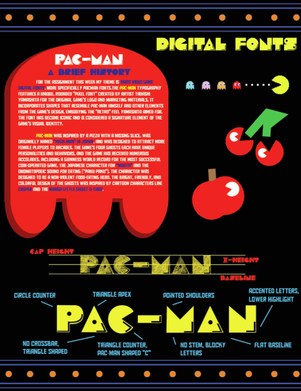

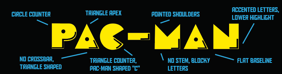
The goal of this assignment was to research digital styles of typography. I chose to look into the art style of the original pac-man video game.
Pac-man uses very blocky and bold fonts that take up a lot of space. the letters also resemble the pac-man character in the game. They also used accent lines on the letters to make them more stylized and unique to the game.
For this assignment, I sketched my font using guideline in photoshop and transferred it to illustrator to create my page layout. Using the pen tool and shape tools, I was able to create shapes that related to the original game, like the fruits and ghost.
Using adobe express, I was able to create an animated video of the pac-man mage layout. Included the important aspects of the font, and iconic imagery from the pac-man game.
Song Lyric Page design
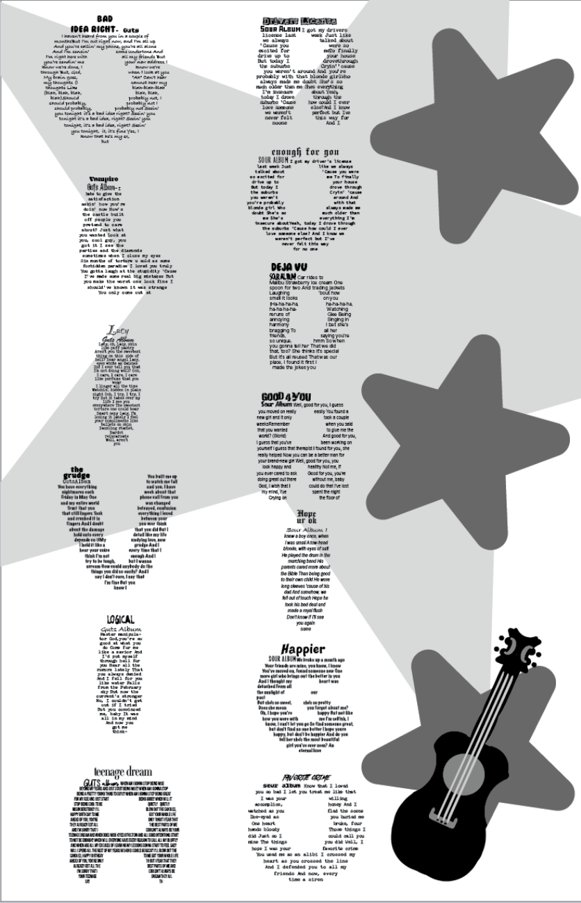
For this assignment, We chose our favorite songs and created words from the song lyrics. I chose Olivia rodrigo as my inspiration and chose fonts that resembled her music style.
To create this piece, i used adobe illustrator to create letter shaped text boxed. I filled the boxes with her song titles and lyrics. When the page is far, it would resemble her name, but be filled with all of her music. I created a guitar from the different punctuation marks within the font.
The page layout remains black and white to better focus on the typographic elements laid out on the page. I wanted to include stars because that is a big part of her brand.
Logo Design project
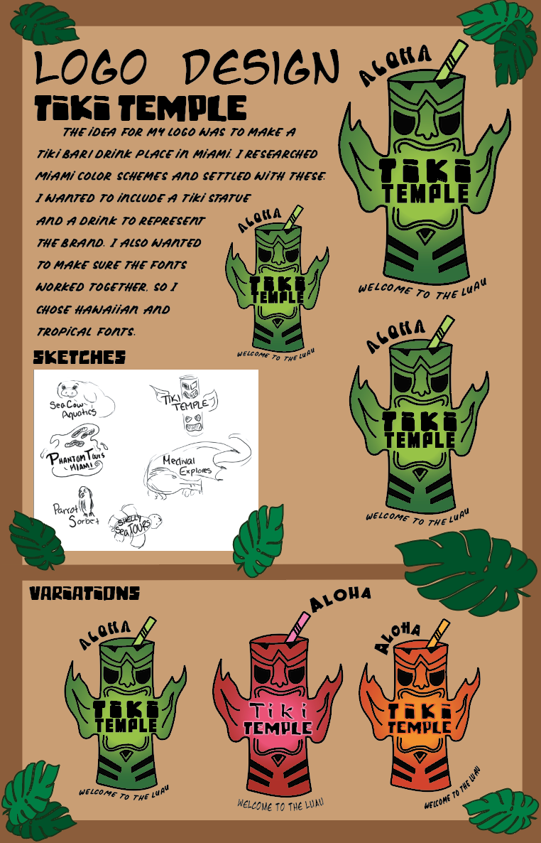
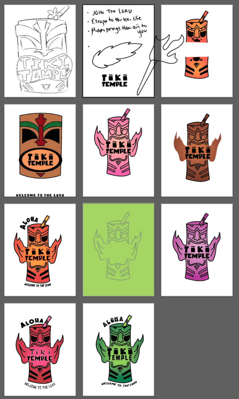
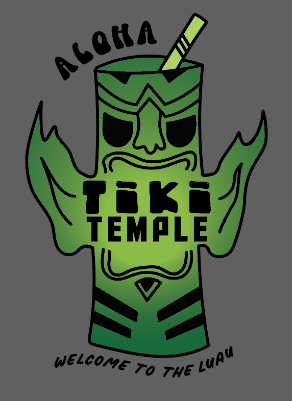
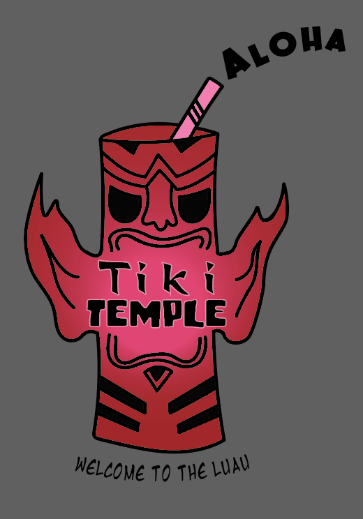
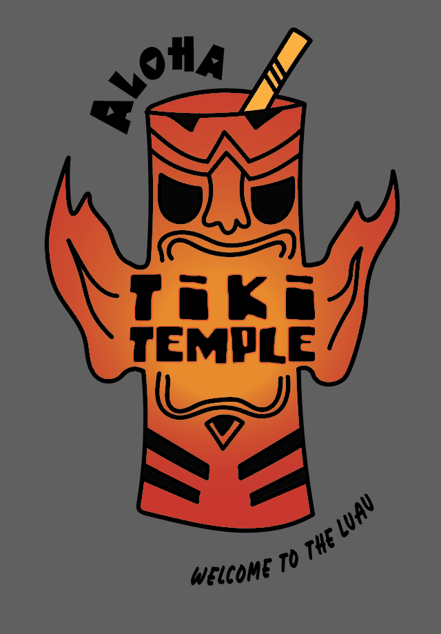
For this project, I had to use fonts in a creative way to create a logo. I wanted to create a tiki bar using tropical colors.
I chose fonts that created a Hawaiian style of tiki bar. I used the type on path tool within illustrator to create a more laid back and fun style. I wanted the logo to feel welcoming. I drew to the tiki mascot in illustrator and used gradients to fade the color from light to dark.
I settled on the green logo because it was easier to read and the three different fonts flowed together.
Traditional editorial Page
For this page design, we had to create a traditional style of an editorial page. I wanted to make it into a newspaper layout using different font styles and sized to create a hierarchy.
To show importance, I made sections bolded, larger, and italicized. For the rest of the text I used a font that is easy to read and a more tradition style for a newspaper.
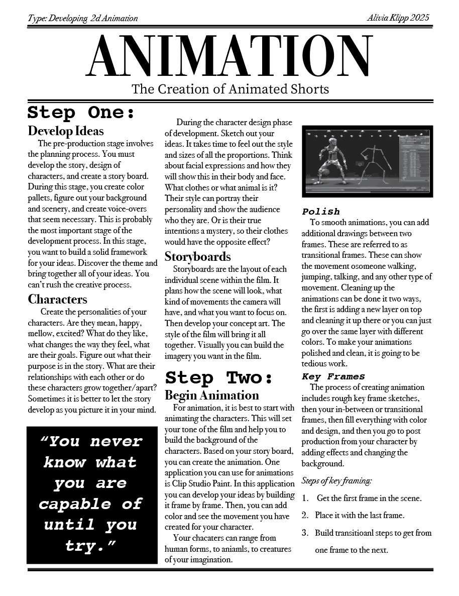
I created a page that is about the creation of animation. I organized the page to show the steps involved and included quotes and pictures that follow what the text is talking about.
Modernized Editorial Page
For this assinment, we had to create a non-traditional editorial page. The goal was to create a page that involves more elements of creativity and stylized typography.
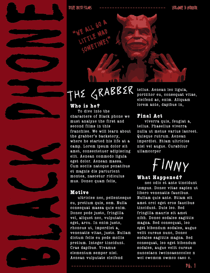
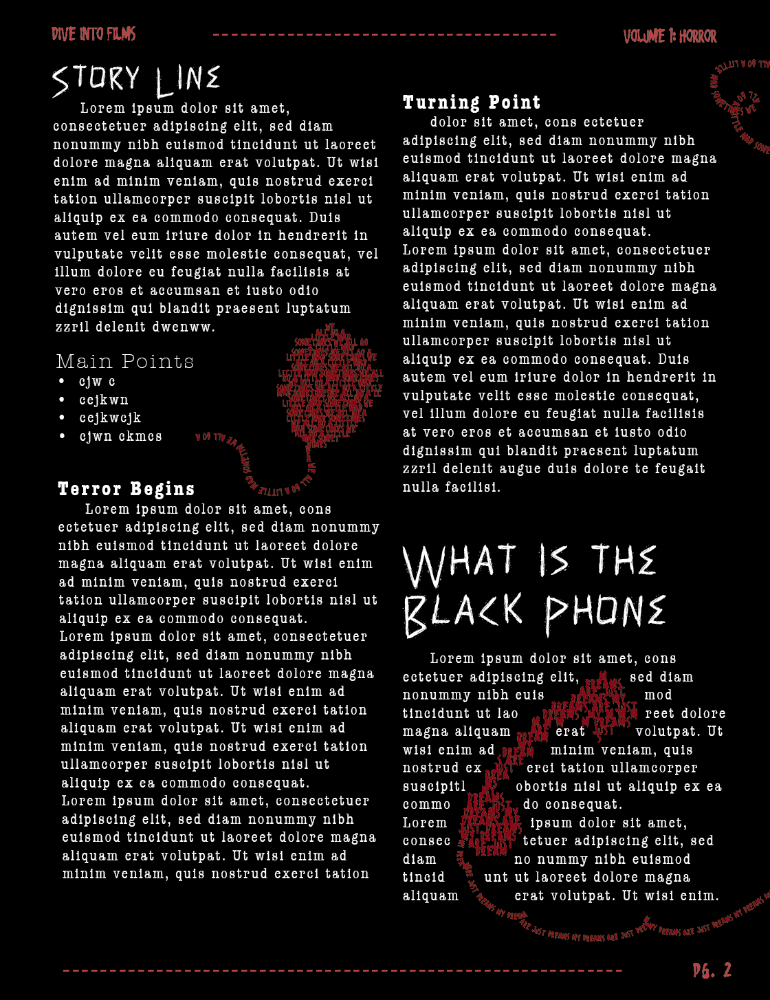
I created a page about the film black phone. I wanted to have a black, red and while color scheme to relate to the horror of the film. I used a typewriter font, and a creepy font for titles. To introduce the article, I did a sideways and larger black font so it stood out. I also created shaped type boxes to include quotes within iconic elements that are from the film.
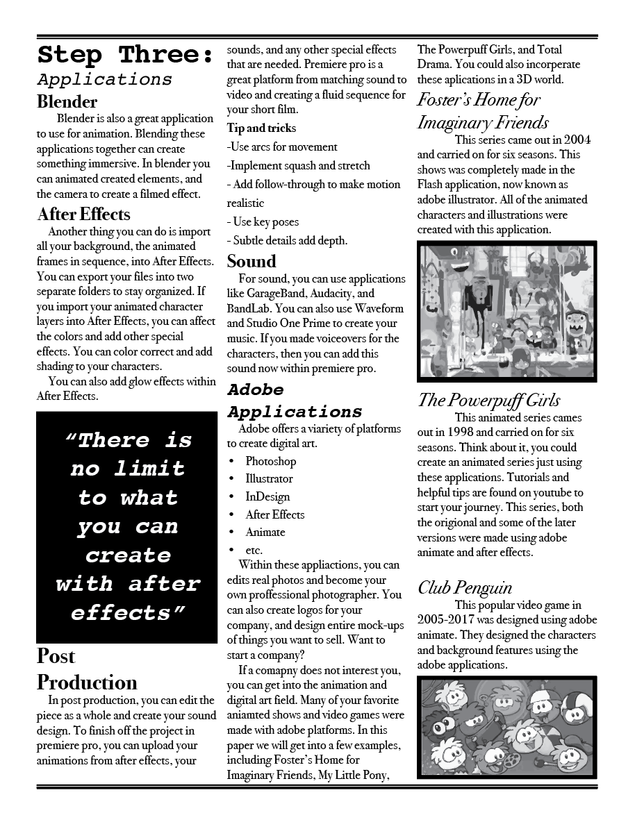
I used adobe illustrator for the entire page layout. I used the type on path tool, image trace, and guidelines for the majority of this page.